Why Website Popup Design Matters
Love them or hate them, popups work—and when done right, they can skyrocket your signups and sales. But the key to their success lies in website popup design that’s clean, compelling, and timed perfectly.
A well-designed popup grabs attention at the right moment and offers something valuable enough to make people stop, engage, and take action.
Whether it’s a discount, free guide, or exclusive access, a well-thought-out website popup design can turn casual visitors into leads you can nurture and monetize. But here’s the catch: not all popups are created equal. Done wrong, they’re annoying and disruptive. Done right, they’re a seamless, high-converting part of your marketing strategy.
Below, you’ll learn the elements that make popups command attention, deliver value, and leave your audience wanting more—not rolling their eyes. Let’s get started.
What Makes a Great Website Popup Design?
The Key Elements of a Popup That Converts
Not all popups are created equal. A great website popup design grabs attention, provides value, and makes it ridiculously easy for your audience to take action. Here are the essential elements of a high-converting popup:
Strong Headline
The headline is your first (and sometimes only) chance to hook your audience. Keep it bold, clear, and benefit-driven.
- Example: “Get 10% Off Your First Order” or “Don’t Miss This Exclusive Freebie!”
Compelling Offer
People need a reason to sign up. Discounts, freebies, or exclusive content are some of the best ways to capture their interest.
- Why It Works: A compelling offer taps into the psychological trigger of reciprocity—when you give value, people feel compelled to give something in return (like their email).
Simple Design
A popup should be visually appealing but not overwhelming. Use clean, on-brand visuals with minimal distractions so the focus stays on your message and offer. Let the welcome email focus on delivering the specifics of your product.
- Pro Tip: Stick to easy-to-read fonts and contrasting colors to make your CTA pop.
Clear Call-to-Action (CTA)
Tell people exactly what to do with clear, action-oriented language. Avoid generic CTAs like “Submit” and go for something more engaging.
- Examples: “Claim My Discount,” “Download My Free Guide,” or “Get Exclusive Access.”
Mobile-Friendly Layout
With so many users browsing on mobile, your popup needs to look great on all devices. A responsive design ensures your message is clear, no matter the screen size.
- Why It Matters: A poorly designed mobile popup can frustrate users and hurt conversions.
When these elements come together, you get a popup that doesn’t just look good—it converts. The best popups are quick, valuable, and to the point, leaving your audience with no reason to click away.
Types of Popups and When to Use Them
Match Your Popup Style to Your Goals
Popups aren’t one-size-fits-all—they come in different styles and can be triggered in specific ways, depending on the popup software or app you’re using. Whether you’re looking to capture emails, prevent abandoned visits, or boost engagement, choosing the right type and trigger ensures your popup delivers maximum impact. Here are the most common types of popups and when to use them:
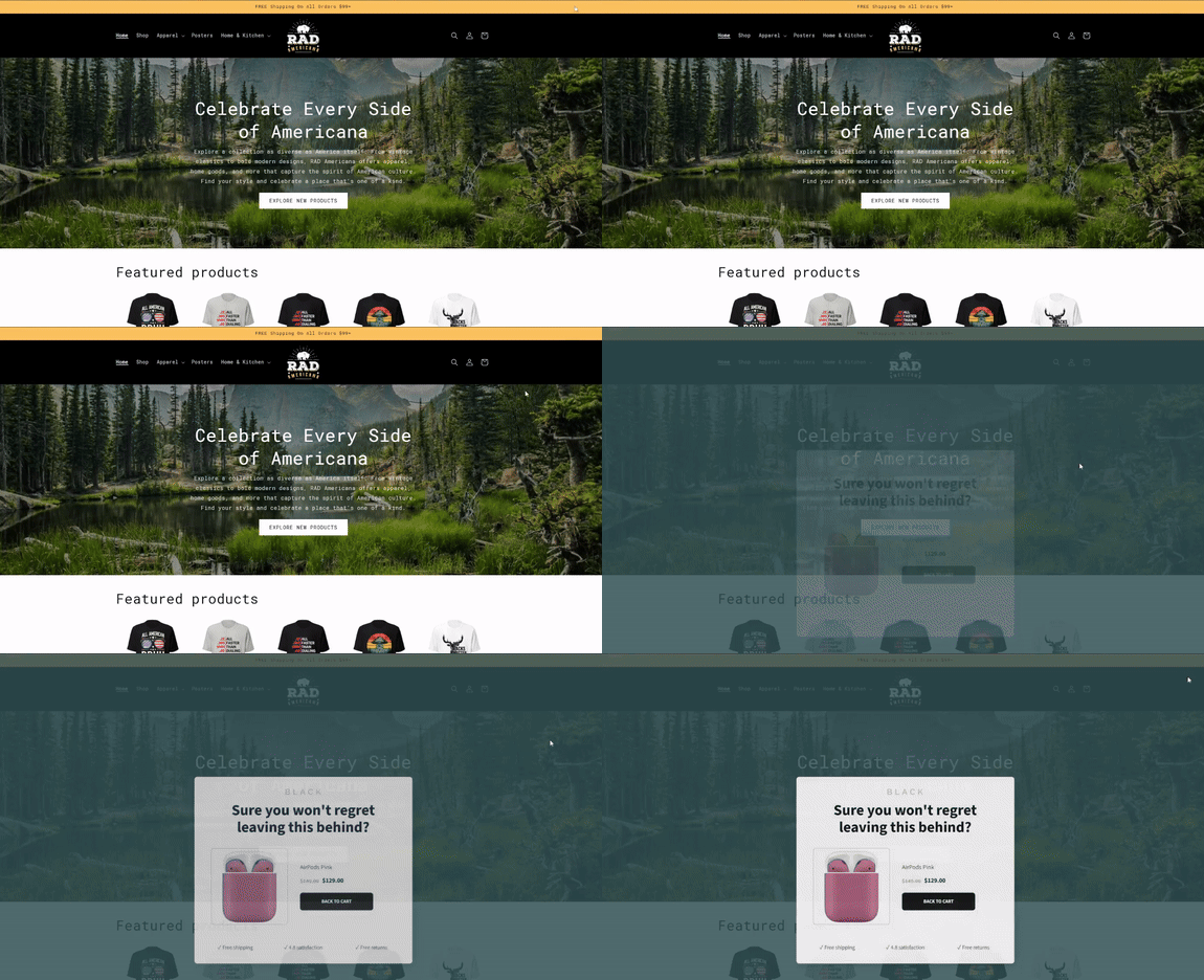
Exit-Intent Popups
- How They Work: These popups appear when a visitor’s cursor moves toward closing the tab or leaving the page. On mobile it's typically when they open a tab or their browser loses focus.
- Best For: Saving visitors who are about to leave without taking action, like completing a purchase or signing up for your list.
- Example Style/Trigger: Can appear as a lightbox overlay or a subtle slide-in popup triggered by exit behavior.
- Example Offer: “Wait! Get 10% Off Before You Go!”

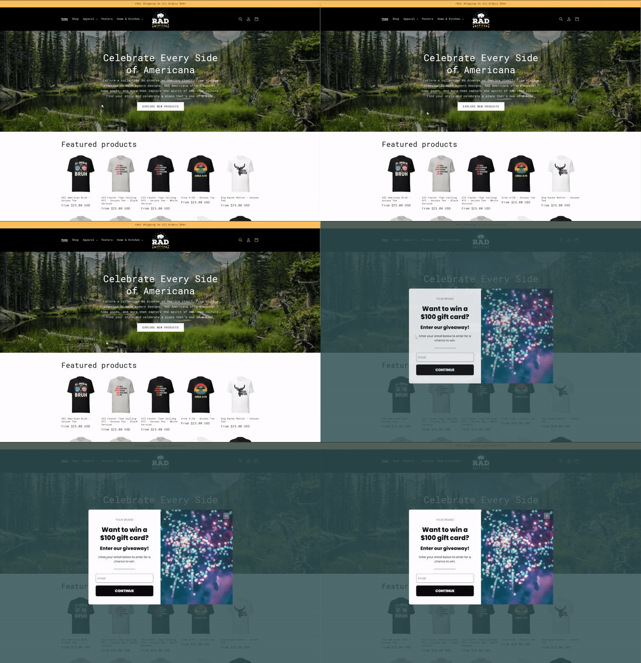
Time-Delayed Popups
- How They Work: These popups are triggered after a visitor has been on your site for a set amount of time.
- Best For: Engaging users who are browsing but haven’t taken any action yet. Great for nurturing visitors who are already somewhat interested.
- Example Style/Trigger: A centered modal or banner popup that appears after 15-30 seconds of inactivity.
- Example Offer: “Enjoying the content? Join our list for more!”

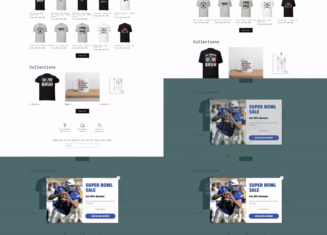
Scroll-Based Popups
- How They Work: These popups appear when a visitor scrolls down a specific percentage of the page.
- Best For: Content-heavy pages like blog posts or product descriptions, where users are already engaged.
- Example Style/Trigger: A slide-in popup from the side or bottom of the screen triggered when a visitor scrolls 50% of the page.
- Example Offer: “Made it this far? Get exclusive tips delivered to your inbox!”

Click-Activated Popups
- How They Work: These popups are triggered when a visitor clicks a specific button, link, or image on your site.
- Best For: Highlighting a specific offer or CTA, like downloading a guide or accessing a discount, in a targeted way.
- Example Style/Trigger: A popup that overlays the page after the user interacts with a clickable element.
- Example Offer: “Click here for your free eBook!”

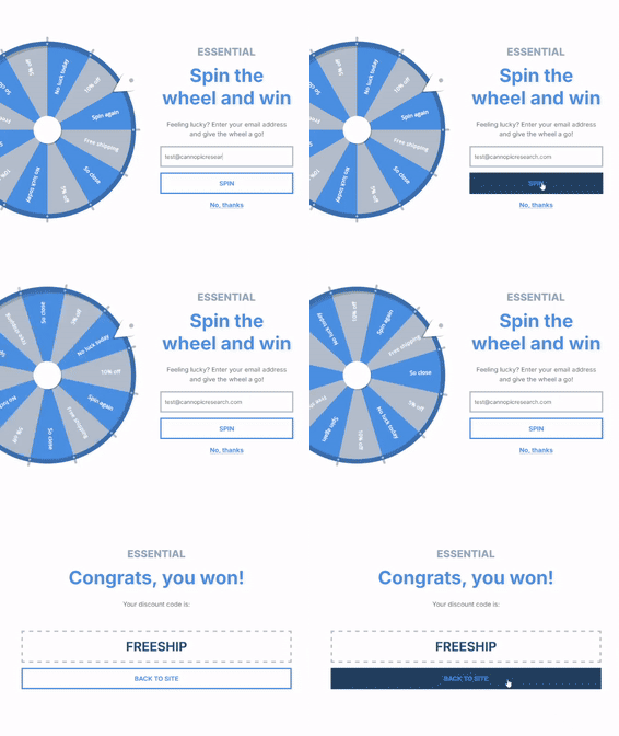
Gamified Popups
- How They Work: These interactive popups (like spin-to-win wheels or scratch-to-reveal offers) create a fun and engaging experience for visitors.
- Best For: Boosting lead capture with an entertaining twist, perfect for ecommerce or promotional campaigns.
- Example Style/Trigger: A wheel popup triggered on-page load or after scrolling, with interactive elements for the user to engage.
- Example Offer: “Spin the wheel for a chance to win 20% off!”

The beauty of popup styles and triggers lies in their flexibility. Depending on the software or app you’re using, you can customize when, where, and how popups appear to best fit your goals and audience behavior.
The right combination of design and timing ensures your popups engage visitors without annoying them—and most importantly, drive conversions.
Best Practices for Creating Popups
How to Maximize Engagement Without Annoying Your Visitors
Creating a popup that converts doesn’t mean bombarding your visitors every time they land on your site. A great popup strikes the perfect balance between grabbing attention and respecting the user experience. Here are some best practices to ensure your popups work effectively without driving your audience away:
1. Keep It Relevant
Your popup should align with your audience’s needs and where they are in their journey. Offering a discount on their first order? Target new visitors. Sharing a free guide? Use it on a content-heavy page like a blog post.
Pro Tip: Segment your audience so the popup matches their behavior—for example, showing a cart abandonment popup only to users who’ve added items to their cart.
2. Use Exit-Intent Popups Wisely
Exit-intent popups are powerful but can be overused. Save them for high-value offers, like recovering abandoned carts or offering discounts to hesitant buyers.
Pro Tip: Avoid using exit-intent popups on every page. Focus on key areas like checkout, product pages, and the home page where conversions matter most.
3. Limit Frequency
Don’t overwhelm visitors with popups on every click. If a user dismisses a popup, give them a break before showing another one—or better yet, don’t show another at all during that session.
Pro Tip: Use your popup software’s settings to limit how often popups appear for the same user.
4. Leverage Personalization
Make your popups feel personal by tailoring them to your visitors’ behavior, location, or preferences. Personalized messaging feels more relevant and drives higher engagement.
Example: "Welcome back! Here’s 15% off just for you."
5. A/B Test Your Popups
Test different headlines, designs, timing, and CTAs to see what resonates best with your audience. Even small changes can lead to big improvements in conversions.
Pro Tip: Run one test at a time so you can clearly see what’s working and what isn’t.
6. Prioritize Mobile-Friendliness
Popups that look great on desktop can completely disrupt the experience on mobile. Make sure your design is responsive and doesn’t block the entire screen for mobile users.
Pro Tip: Consider using smaller, slide-in popups for mobile instead of full-screen modals. Include an easy way for the user to close the popup otherwise they may not be able to close it at all... Which will immediately kill any potential sale.
7. Focus on Timing and Placement
Timing is everything. Don’t bombard visitors with a popup the second they land on your site—give them a chance to browse first. Use triggers like time spent on page, scrolling, or exit intent for maximum impact.
Pro Tip: Place popups strategically on key pages, like product pages, blog posts, or checkout pages.
By following these best practices, you can create popups that enhance your visitors’ experience, drive engagement, and boost conversions—all without coming across as pushy or disruptive. A well-crafted popup is a tool that works with your audience, not against them.
Next Steps
Stop leaving money on the table and start making your website work for you. Whether you're struggling with popups, engagement, or conversions—I’ve got you covered.
Here’s how I can help:
- Book a Consultation: Let’s create a custom game plan to boost your email results. No fluff, just real strategies that work.
- Done-For-You Services: Want it off your plate? I’ll build your email marketing systems from scratch so you can focus on what you do best.
- DIY Guide: Ready to dive in yourself? Check out my step-by-step tutorial on creating a popup from scratch. You’ll go from zero to a fully functional, high-converting popup in no time. (Coming Soon)
Click the link, book a call, or start building today—because results don’t wait.